

NuZee Coffee
Repositioning and Redesigning the Largest Single-Serve Coffee Company in North America
Problem.
Help a low-awareness coffee processor move from backend resource for hire to authoritative purveyor of single serve coffee processing and packaging in North America.
Insight
While NuZee is a coffee co-packer, the brand feels too focused on machinery and production and makes too many assumptions that prospects (1) know what they do and (2) are aware of the innovative single-serve coffee formfactors available from the company.
All co-packing companies have machinery, few have a genuine love of coffee innovation and craft.

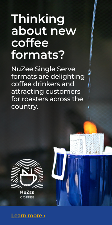
The new look and feel is pulled from the logo to the packaging, advertising and website. The work is note only representative of the NuZee business, but also representing the company origin of Asia, it’s products and love of coffee.
Execution
Our strategy of coffee love + craft was pulled into a new logo designed by Tina Hsu Design. This logo utilizes the Pacific Rim heritage of NuZee to visually tell the story of the NuZee products. The N into the mug represents the specialized single-serve experience that NuZee creates. Water, represented here as waves that surround the mug, is an intrinsic part of coffee culture and a representation of the Pacific Rim. These waves can also be viewed as a reference to the rows of coffee trees that grow the beans we depend on. We have added texture in the form of a “stamp” treatment to represent the human touch and craftsmanship of the NuZee team.
